A comprehensive definition of a Design System
A design system is a collection of elements and practices that define how a product is designed, built, and comprehended. Design systems shouldn’t be confused with single elements like layouts, color pallets, fonts, or bits of code. It seems many companies are using the term improperly, creating confusion about its meaning. However, that’s not unexpected because a design system does include all those elements. Think about how easily you recognize Apple solely by looking at a button. This one simple element contains so much information, which is indicative of a successful design system. You recognize it as a button, so you understand its purpose and how to use it, and as part of a brand simultaneously.So, why are Design Systems important?
Design systems outline your UI elements, based on your brand’s identity and use so designers and developers can straightforwardly collaborate on a product that consumers can easily understand. Setting a series of rules for design and functionality that intertwine with brand value at their core sets the stage for interdepartmental success. Not to mention, training new employees becomes easier. The documented methodology and elements associated with every possible use case avoid confusion and expedites the training timeframe. Externally, design systems help consumers understand your products better. Usability improves and consistency throughout all of your products allow consumers to easily associate them with your brand.The History of Design Systems, Briefly
Design systems are not a new concept, they’ve been around for generations. In 1976, the NASA Graphics Standards Manual was released. Though this guide doesn’t involve code, it outlines when and where to use the NASA logo and provides a strict color pallet for the organization. In terms of interaction design, the early 2000s were booming with websites that curated or cataloged UI patterns. Most are not available today, but you can imagine how dated the patterns must be. Consumer UI up until that point was not attractive nor user-friendly, so it may be a blessing that those websites are defunct. We wouldn’t want anyone using them as a resource for design in 2020. The book that catapulted UX design around 2010 was Brad Frost’s Atomic Design. While it isn’t without its flaws, this book attempted to create a guide on building frameworks for real-world screen flows. Microsoft was ahead of the curve, even if it didn’t catch on, with its Metro UI (which underwent several name changes in subsequent years) as a design system in 2006. Its focus on typography, padding, and clear design guidelines has been adopted by many brands, large and small, over the years. Material Design by Google may be the one design system that gained the most publicity. It was introduced in 2014 and not only gave Google a unique visual design language, it provided usage guidelines and reasoning for designers that are still being used to this day. Today, we are at something of a stalemate between designers and design systems. At the core, designers want to do just that: design. These systems take away the creativity and exploration that designers once infatuated themselves with. However, design systems allow designers to prototype more quickly. And many work at companies whose language falls in line with their own style, so they don’t feel robbed.
The Steps to Build a highly functioning Design System
Step 1: Inspect your current design
The first step to create a design system is to inspect and investigate your current design. Take notes on what you like about your app or website’s current design.- What don’t you like about it?
- Have any users given you praise or complaints on specific aspects?
- What CSS are you using?
- What style is your product?
Step 2: Construct a visual design language
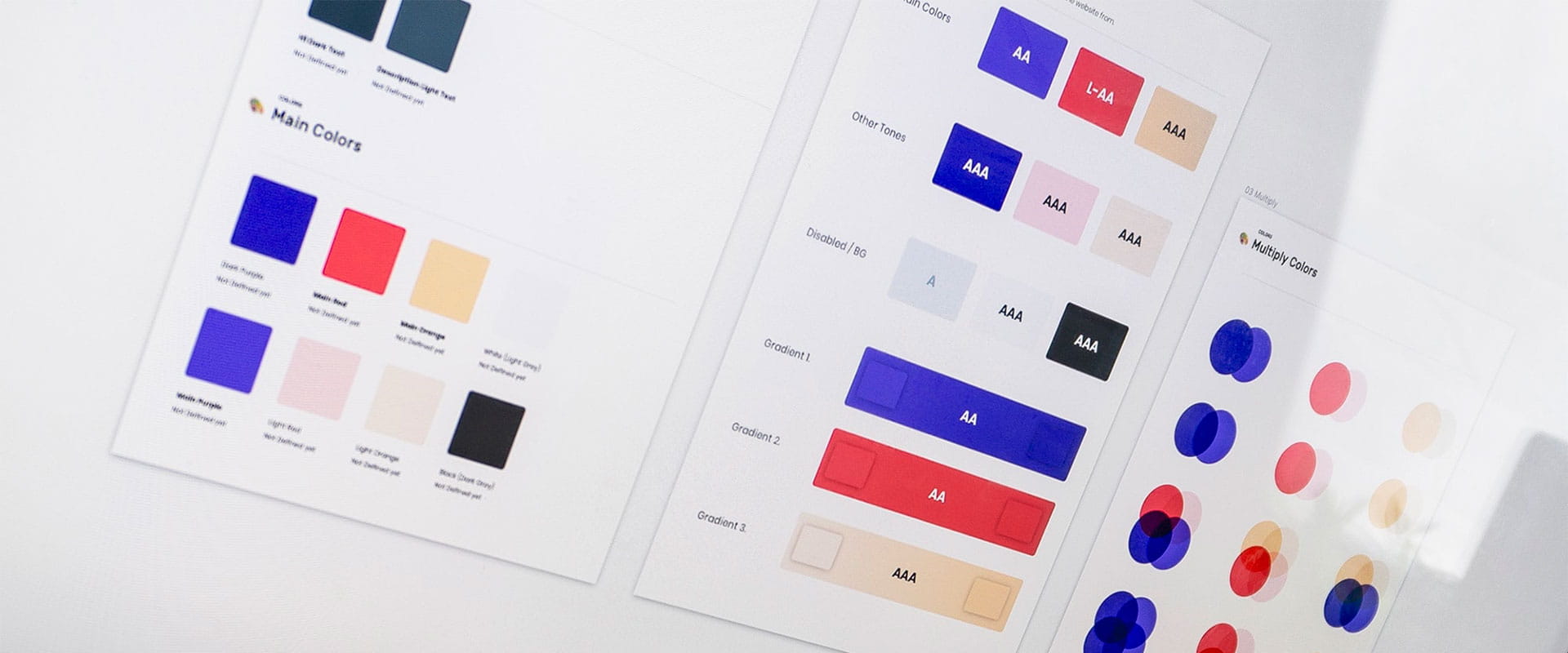
Once you’ve surveyed and answered the questions from Step 1, create a visual design language. This is the heart of your design system. It utilizes and defines every component’s identity and use-case that build a comprehensible, usable digital product.- Color Theory - Perform color theory research and find a pallet that fits your ideology, consumer-base, and future brand identity. Identify which colors are used on which elements and leave none unassigned. You’re essentially making a “Colors of My Brand and Where to Use Them for Dummies” manual.
- Fonts - Decide on fonts and typography for your product. You shouldn’t need more than 2: one for headings and one for the body. The simpler the better when it comes to the number of fonts you use, as you don’t want to confuse your users. It’s also less confusing for designers when there are only two fonts to choose from. However, a third font for the body can help break up a monotonous-looking text.
- Spacing - Spacing and sizing of all elements need to be outlined. The size and weight of your fonts and where to use them, letter spacing, word spacing, margins, padding, and text justification should be explicitly outlined. Beyond text, padding and spacing between other visual elements like buttons and images need to be described.
- Icons - Many companies fail in creating compatibility between the Icons, graphics, and images they use with the rest of the visual design language. Keep a strict catalog of icons and examples or a mood board of images and illustrations for designers to follow. Images and illustrations are often updated, so it’s understandable that this area is where brands fall off course.
Step 3: Build a pattern library with documented use cases
Consider every component of your UI: buttons, images, icons, text boxes, forms, etc. This library lets you assign each element to a function that designers cannot waver from. Usage guidelines are explicit, helping define your visual identity with congruency on any device. These guidelines are what distinguishes a standard pattern library from a full-fledged design system. In modern design systems, cards the most used component. They are used for notifications, individualizing images with captions, quotes, product, and so much more. However, cards are not only a way to break up content and group it for effective readability. They should have a set use with each form of card. By following these guidelines, designers and developers understand that Card A is specifically meant for titles and descriptions while Card B is meant for images and captions. These minute details define the dividing line between pattern libraries and design systems. This applies not only to cards, but to forms, buttons, widgets, data tables, and any other perceivable component.Some examples of great Design Systems
Material Design
Source: Google
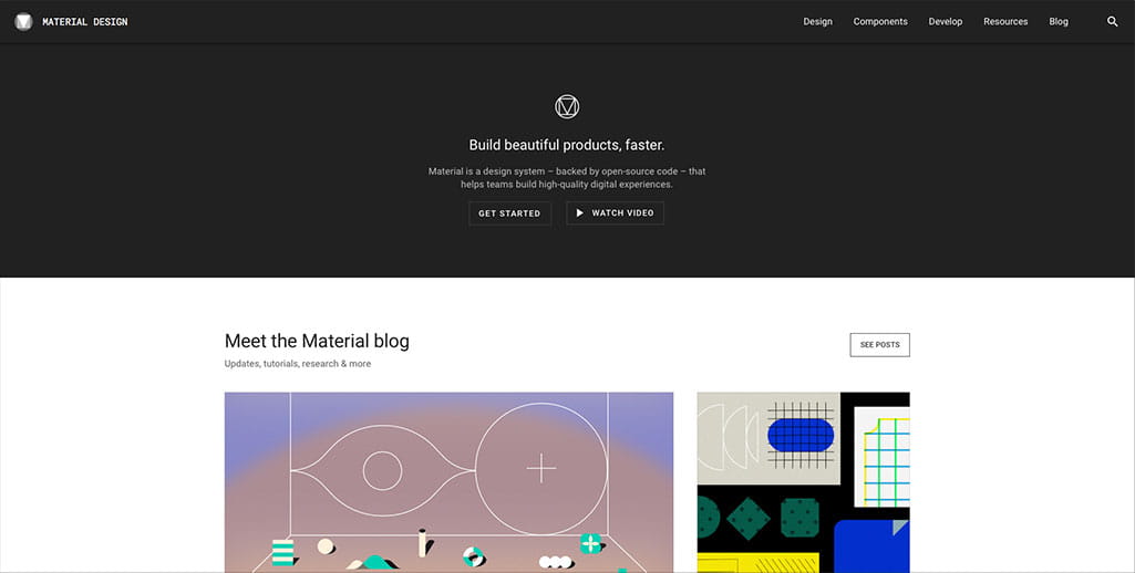
Material Design is the most popular design system. It’s created by Google and thus has extensive reach with all of their products: Android, AdWords, Gmail, Google Teams, etc. Material design is what allows users to recognize it when they see a Google product. It was developed in 2014 and has since been updated and reshaped accordingly. However, that’s the beauty of a design language. It visual language is just a part of the system, so functionality and use remain the same even if colors and typography are updated.Fluent Design
Source: Microsoft
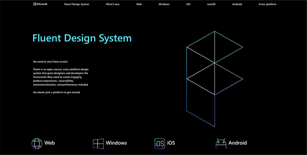
Fluent Design is Microsoft’s update to their Metro or Modern or Windows design system and has received a lot of hype in recent months. It’s already been implemented and brings a fresh yet consistent UX to all of their apps, websites, and services no matter which OS you’re using. They’ve done a commendable job in implementing their own design language while utilizing aspects of the host OS. Apps look native yet distinctly Microsoft.Polaris
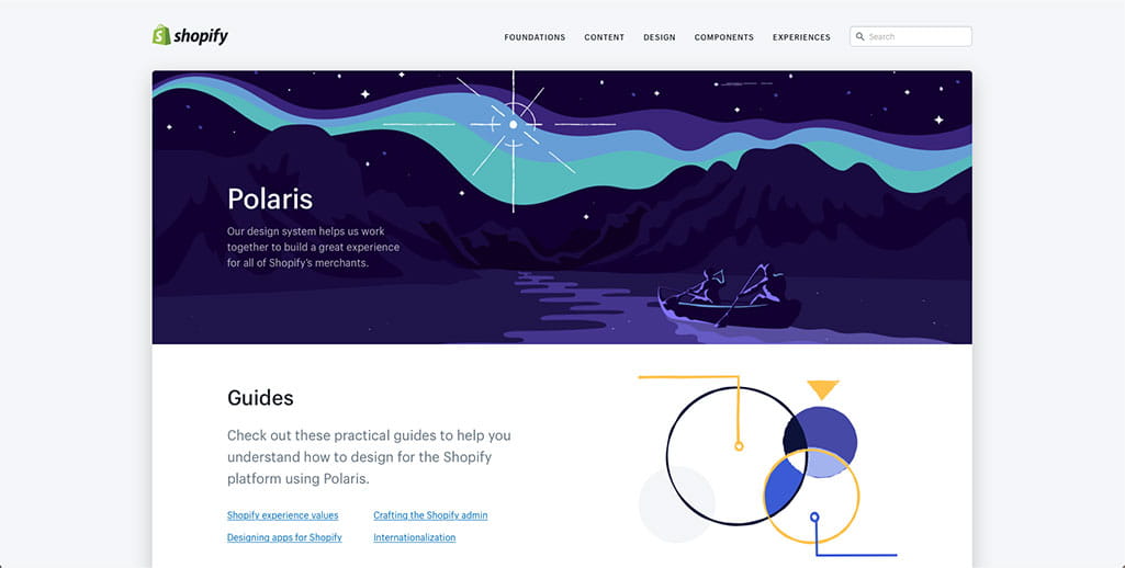
Source: Shopify
Shopify’s Polaris outlines design and experiences for building an app or site with merchant use at its core. All of their guidelines speak to how each element will affect a merchant and why it’s either good or bad practice. Polaris gives designers set tools, but its guidelines are fairly loose as every site will have to match its own brand, not Shopify’s. So, with Polaris, Shopify built a design system that doesn’t enforce its own elements (like typography or color), instead opting to provide guidelines to build a successful store.Lightning Design System
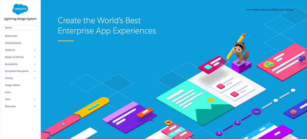
Source: Salesforce
The Lightning Design System by Salesforce also steps even further away from visual identity to focus on logistics, UX, and user flows. These guidelines don’t force any pixel-related design onto designers, choosing to focus heavily on accessibility. It makes sense for a customer relations management company to follow this route, as it’s more of a backend or integrated service.Encore
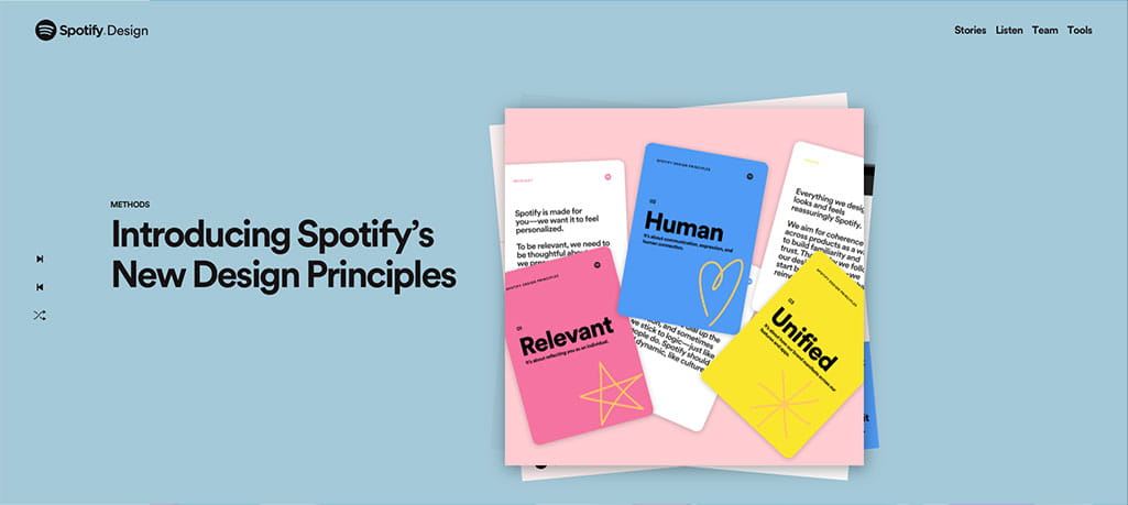
Source: Spotify
Spotify announced its series of design systems at the end of 2019 called Encore. We’re used to their GLUE design system, which gave us the look and feel we all know and love about Spotify. The catch was that as technology advanced, the GLUE system no longer fit. As teams within Spotify sought to put their service on new IoT devices, smart speakers, and cars, they could no longer consult with the GLUE team because it was disbanded. That’s the drawback of singular design systems: once they’re built, they’re seldom updated. To keep up, Spotify unveiled its Encore design systems (plural). It reuses the groundwork from GLUE and the 22 others that were created thereafter to build a family of systems that speak together.How Omnis can help you create a Design System
With Omnis Digital’s UX and UI service, creating a design system has never been easier. By the end of our service, you’ll have a highly functioning design system to share and utilize with any designer and on any website, app, or digital product.Our best UX and UI Projects
ESIL
ESIL is an environmental sustainability startup that we updated and designed the visual language for. Handling their website design, marketing strategy, and branding allowed us to fully create a design system unique to ESIL. They now have a visual language that is consistent throughout their website, logo, and marketing materials. This design is outlined and shared with them to utilize on any future materials.LanGate
LanGate, an app used by both teachers and students, was particularly challenging. The purpose of the app is to connect students with teachers in the classroom. The UI and UX were designed to be attractive, usable, and understandable by both adults and children. During the development, creating a design system helped our team to simplify the experience while focusing on usability by both groups. The end product is an attractive, easy-to-use app that both teachers and students, alike, can understand and utilize effortlessly.Emanuel
Emanuel is the largest market for leather accessories in Israel. Developing a design language consistent with user intention, company objective, and the products they sell took several unconventional steps that lead to success. Interviewing real customers on their experience with Emanuel’s service helped us define user intention, which allowed us to create a service with that intent at its core. Keeping in mind the company’s objective of raising conversion rates, we developed a design language that complements the leather products they sell, alleviates user leeriness, and increases click rates.The benefits of using Omnis to create your Design System
Take advantage of our UX and UI design expertise. Get in touch with our design experts to get started on building your new design system today.Share this article
TweetCare to chat?
Message us on WhatsApp

Or use our contact form
Contact Us
